StandardX Logo Evolution
Created For [Concept Work] in 2020
Tools used:
 Adobe Illustrator
 Adobe Photoshop
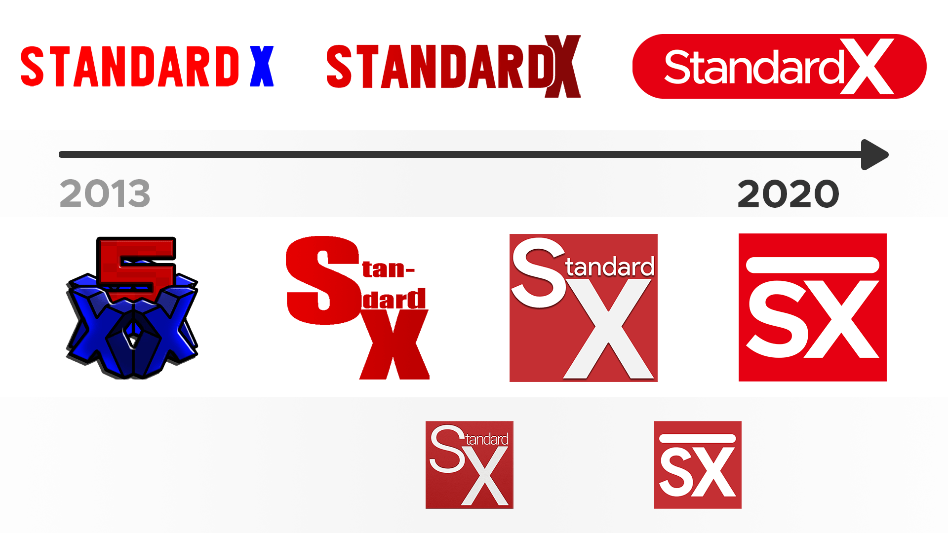
If anything displays how much I’ve learned and evolved as a designer over the years, it’s this. From 2013 to now(2020) there is a clear evolution of my design skills and my current “style”. Who knows where I will be in 10 years.
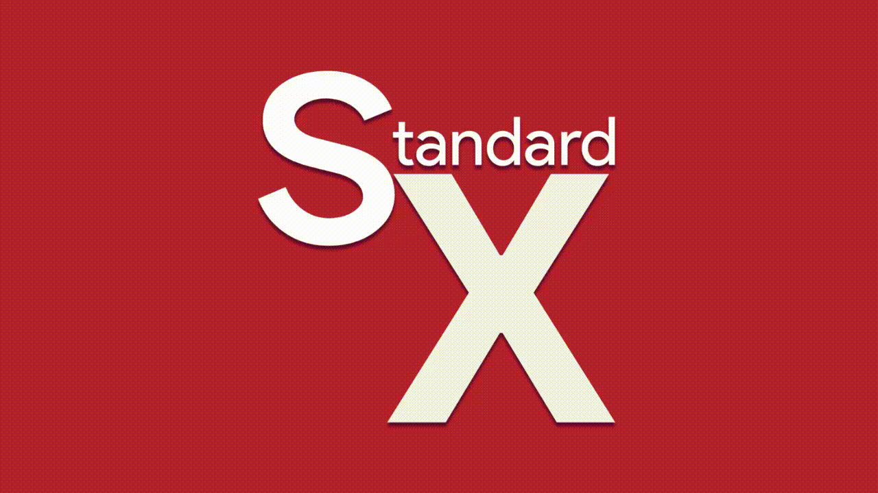
Below are some concepts for 2017 when I wanted to get rid of the word “Standard” in the icon. I felt it would have worked better if I was some kind of sports company, or something like that, but for my use I’m glad I kept experimenting and ended up with what we have today.
Early 2017 Redesign Concepts:


New StandardX Logo Reveal
Created For [Concept Work] in 2017
Tools used:
Adobe Photoshop Adobe Premiere Pro
I wanted a short announcement animation to reveal the new logo/icon, but I also wanted to demonstrate why the new icon looks the way it does. This shows that the line at the top isn’t for nothing. I wanted people already familiar with the branding to not be lost, so the line on top represents the text that used to be in the icon for many years.